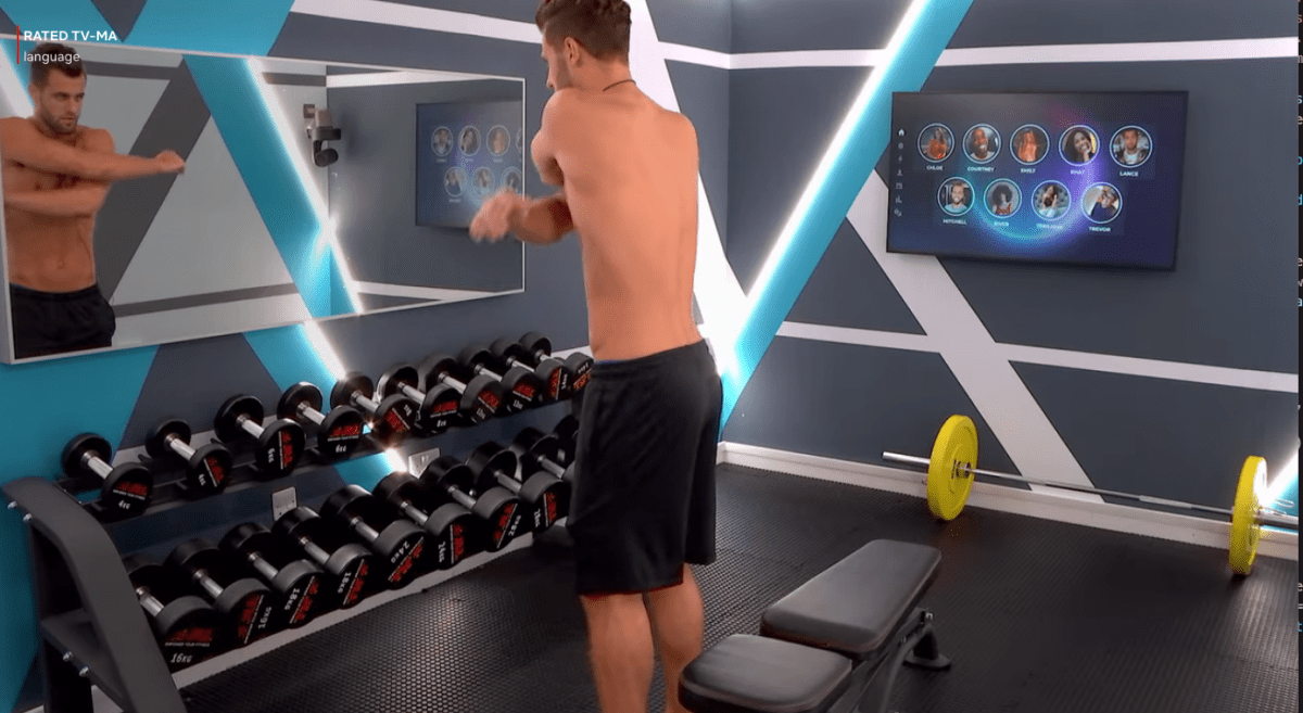
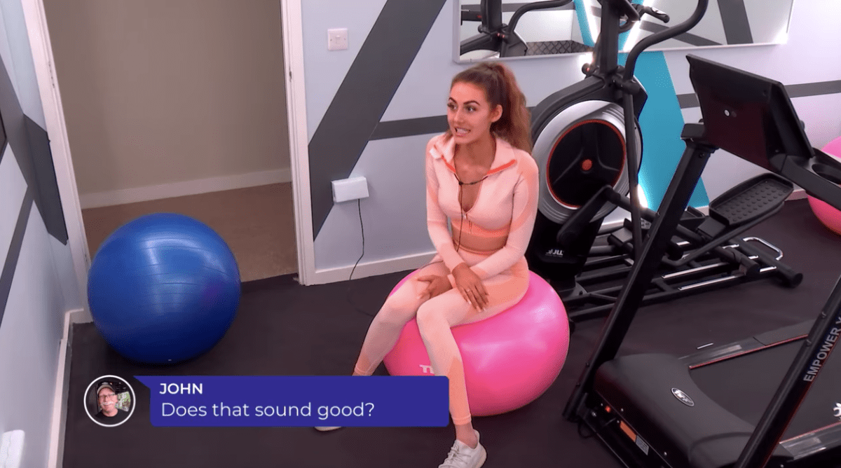
If you’ve been watching The Circle on Netflix, you know that their interior design is always very trendy and usually very bright. I love what they’ve done with the gym for season 2 of The Circle: it’s a bright and colorful gym with lots of light in a small space.

What I love:
- Bright colors! It’s punchy! I am sick of the trend of gyms being full of calming, spa-like spaces (here’s looking at you, Equinox). When I go to work out, I want to be uplifted, not calmed down. The bright blue in the geometric pattern is uplifting, and the wall colors are complementary. I do prefer the lack of dark wall in the cardio room better overall.
- Not overwhelming! Okay I know I just said I love the bright colors, but it can be taken too far; walk into a Planet Fitness, and you’re hit with that color just for the sake of color. Sometimes gym add color just because they don’t know how else to design the space and feel like it has to have some sort of flair. This is a nice balance.
- Compact with good use of space. This gym is small, but still has the essentials.
- Separate cardio room. In a tight space, it makes sense to separate them out.


What causes me to pause:
- Are the lights blinding? I LOVE bright spaces, and that’s a requirement for a home gym to me. However, I can’t tell if these lights would blind me or not. But, it’s gotta be great for filming (especially compared to season 1!)
- The rubber mats are functional but not stylish. Throw a rug over them or something. This is probably the best option for the show or for a commercial gym, but at home I wouldn’t want this. Also the teeth of the mat are showing in the doorway and it’s driving me insane!
- The rainbow bumper plates. I like bright colors, but they just don’t vibe well with the design.


0 Comments